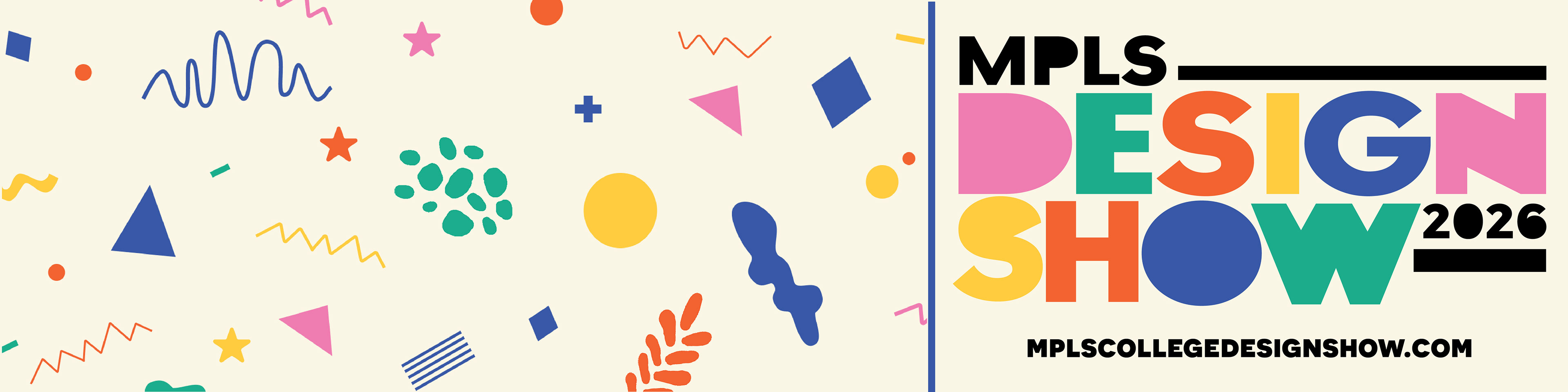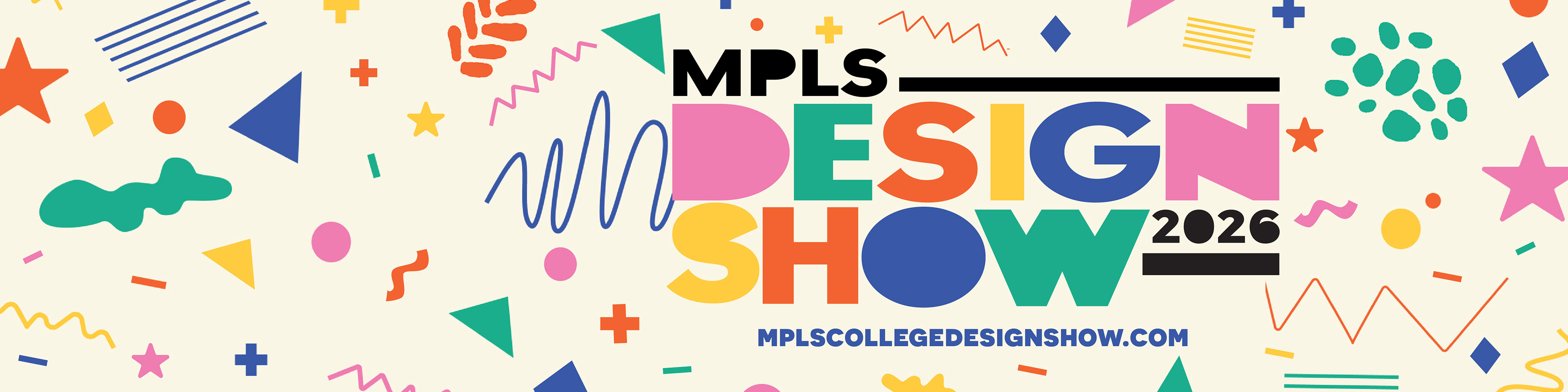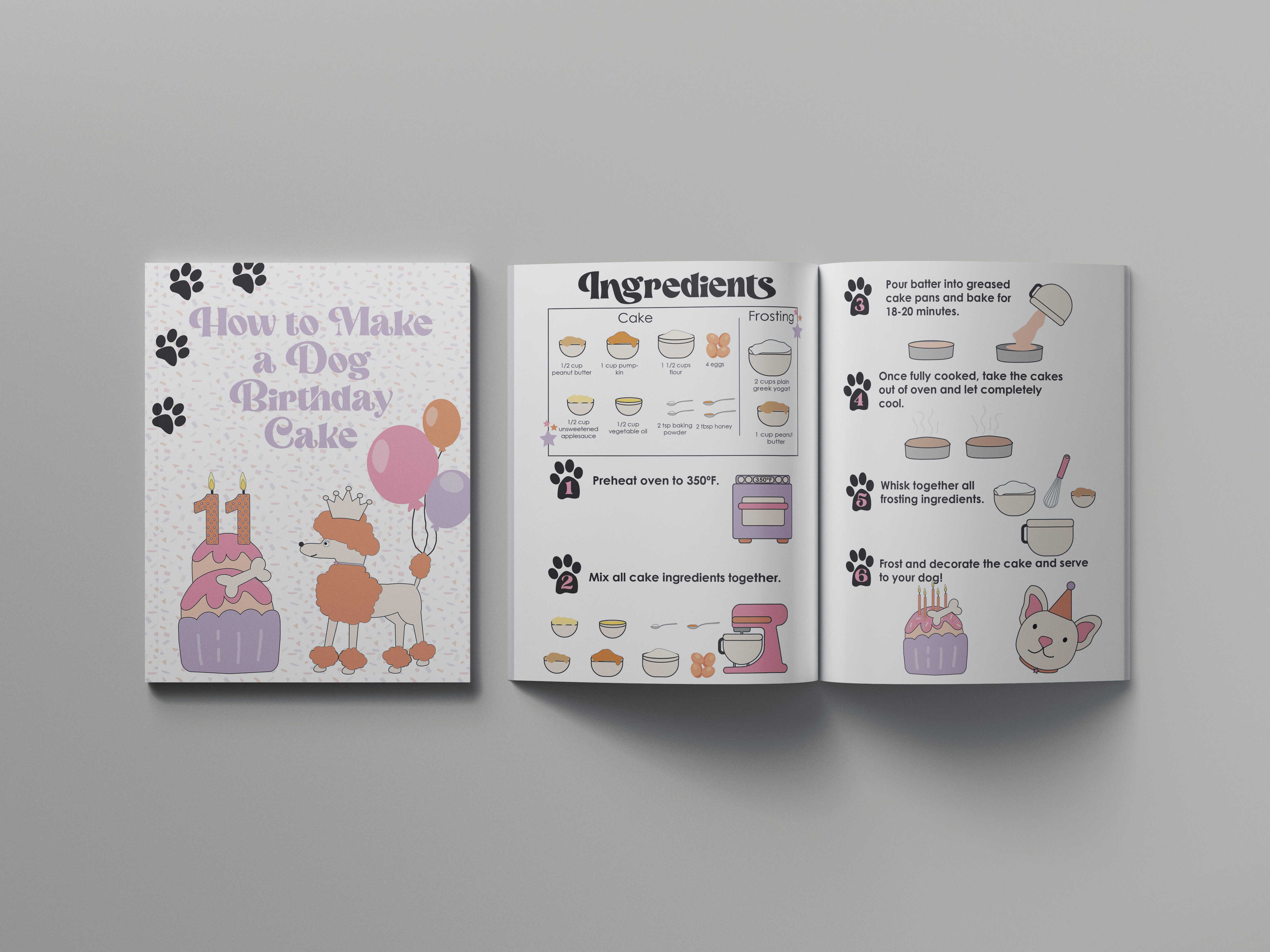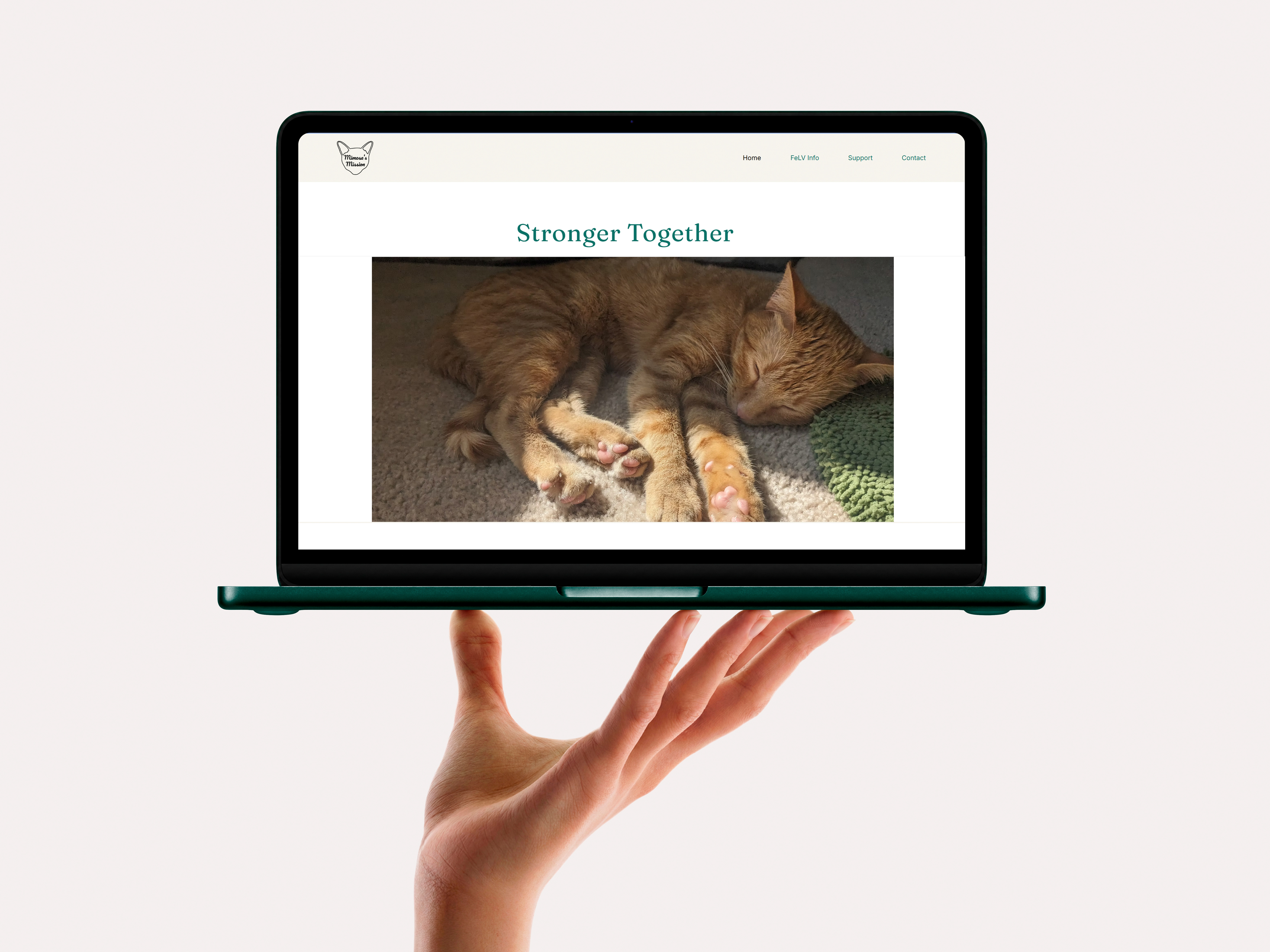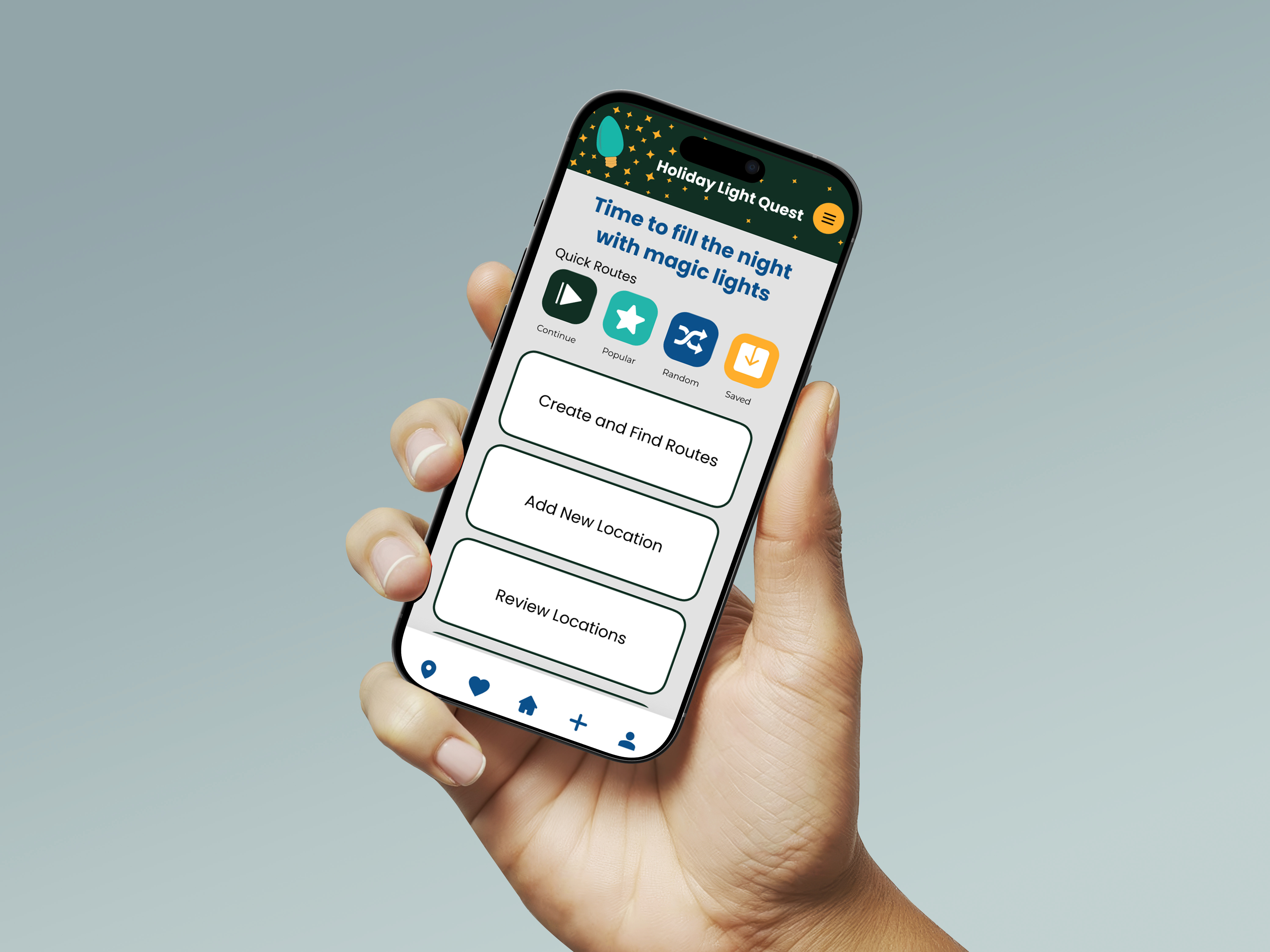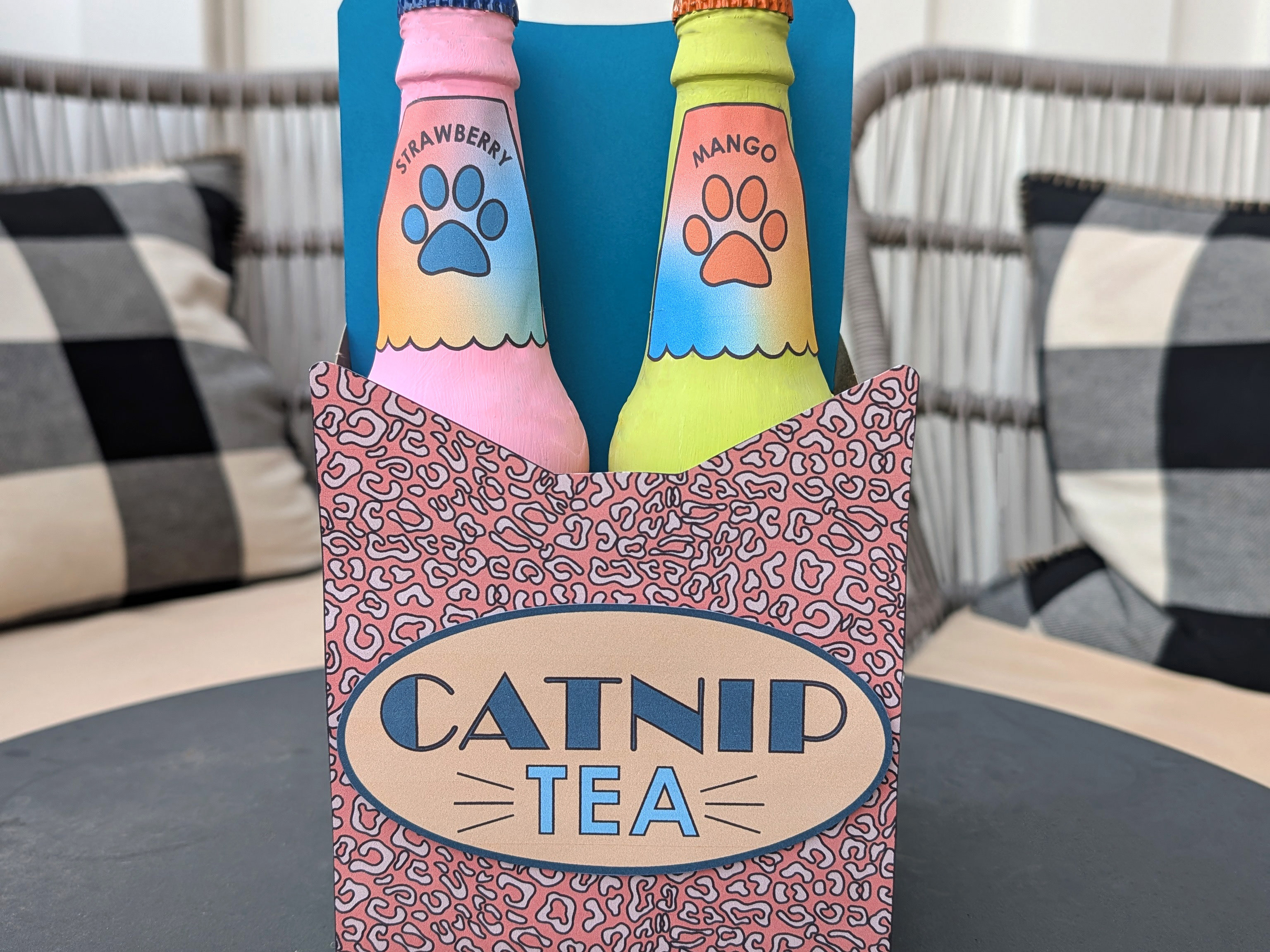
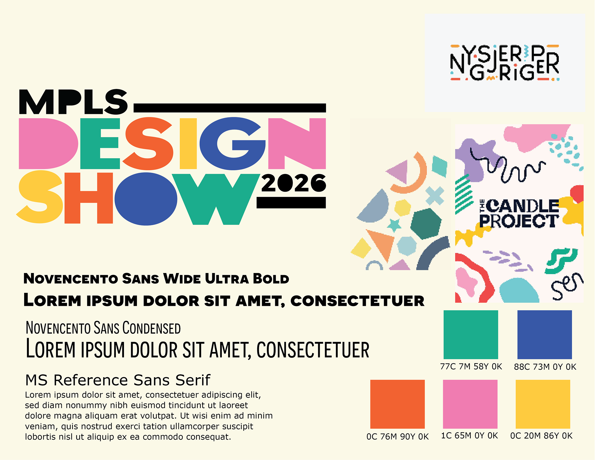
Here is the initial design content and brand assets we were given to create the website.
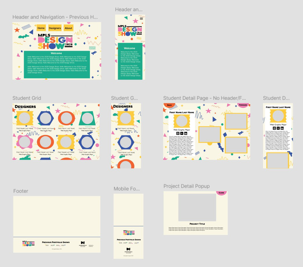
We split the website layout into three main sections, with each of us taking charge of an initial section to design. The image above shows the overall Figma layout we created for the web design. We designed what it would look like on the desktop as well as on a mobile device.
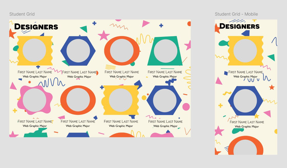
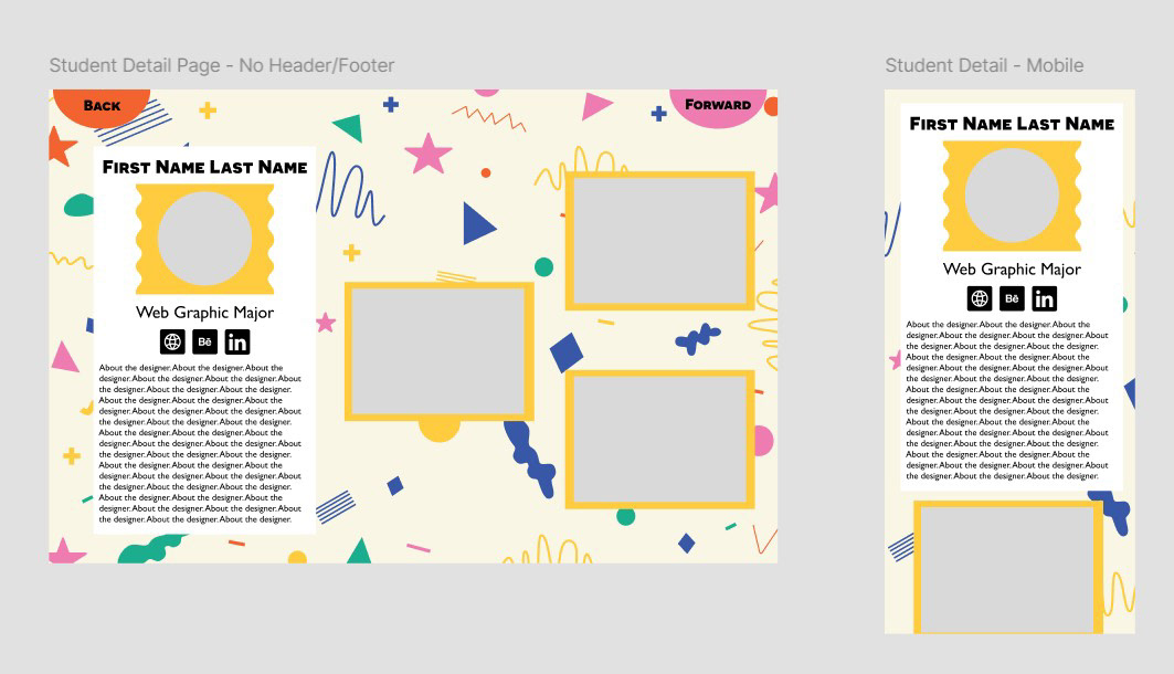
I created the layout for the main page featuring our student designers, as well as the view that opens when a student’s photo is clicked to display their portfolio pieces. I also designed the overall background for the website, creating something fun and playful to match the energy of the overarching design concept.
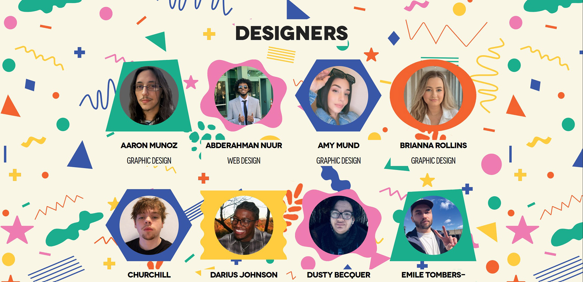
I was responsible for coding the Designer section of the webpage, including the layout and visual elements. Initially, I ran into a challenge getting the background shapes to line up correctly with the photos. After researching solutions and collaborating with a classmate, I successfully resolved the alignment issue. I also helped set up the links so each student profile opened to their individual detail page.
Beyond coding, I designed several visual assets for the site, including the main background image, the decorative shapes behind student photos, and the social icons for the detail pages. Additionally, I formatted and resized all student headshots and portfolio images to ensure proper site performance and layout consistency.

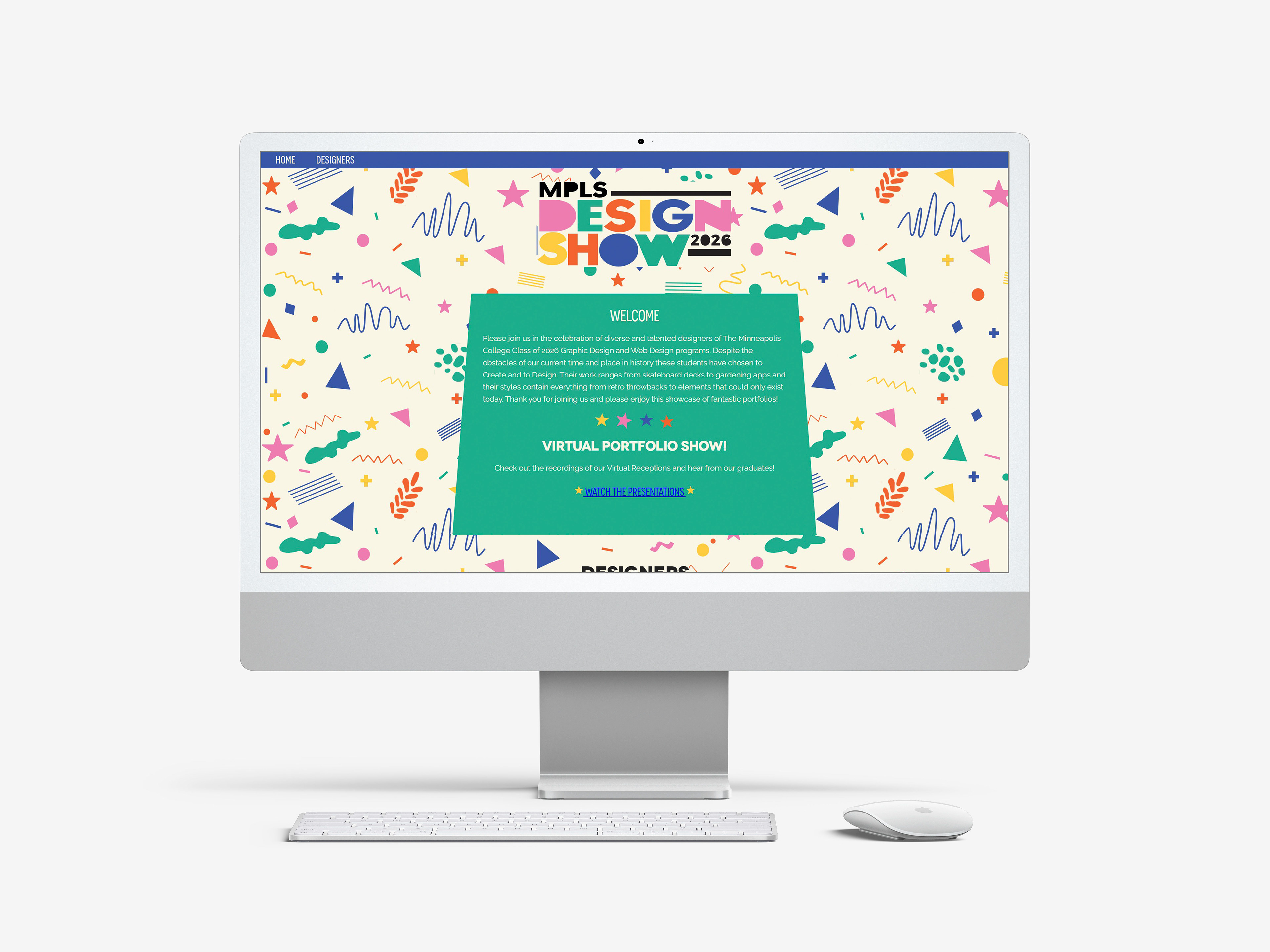
This is the image that my professor chose to use as her LinkedIn banner.